This document outlines the new features that are being pushed on to CloudSupervisor Azure Prod environment. Customers will be able to leverage these new features by taking this document as a guideline.
-
Dashboard
-
1.1 FinOps Dashboard
- 1.1.1 Cost Distribution by Tag
- 1.1.2 Saving Plan and RI Summary
- 1.1.3 Cost Anomalies
- 1.1.4 Utilization Anomalies
- 1.1.5 Region wise service count and cost chart
- 1.1.6 Actual and Forecast Cost
- 1.1.7 Top 10 Subscription with Higher Cost
- 1.1.9 Top 10 Services with Higher Cost
- 1.1.10 Service Category Wise Cost
- 1.1.11 Total VM with Auto Shut Down Schedule
- 2. Finops Dashboard - Monthly Costing
-
1.1 FinOps Dashboard
-
INTRODUCTION
This document outlines the new features that have been added to the CloudSupervisor tool in July 2023.Customers can use this document to leverage the benefits of these newly added features.
This document is intended for company personnel, customers, and partners – they may use it as a reference to understand the feature updates and utilize them accordingly.
-
1. Dashboard
-
1.1 FinOps Dashboard
-
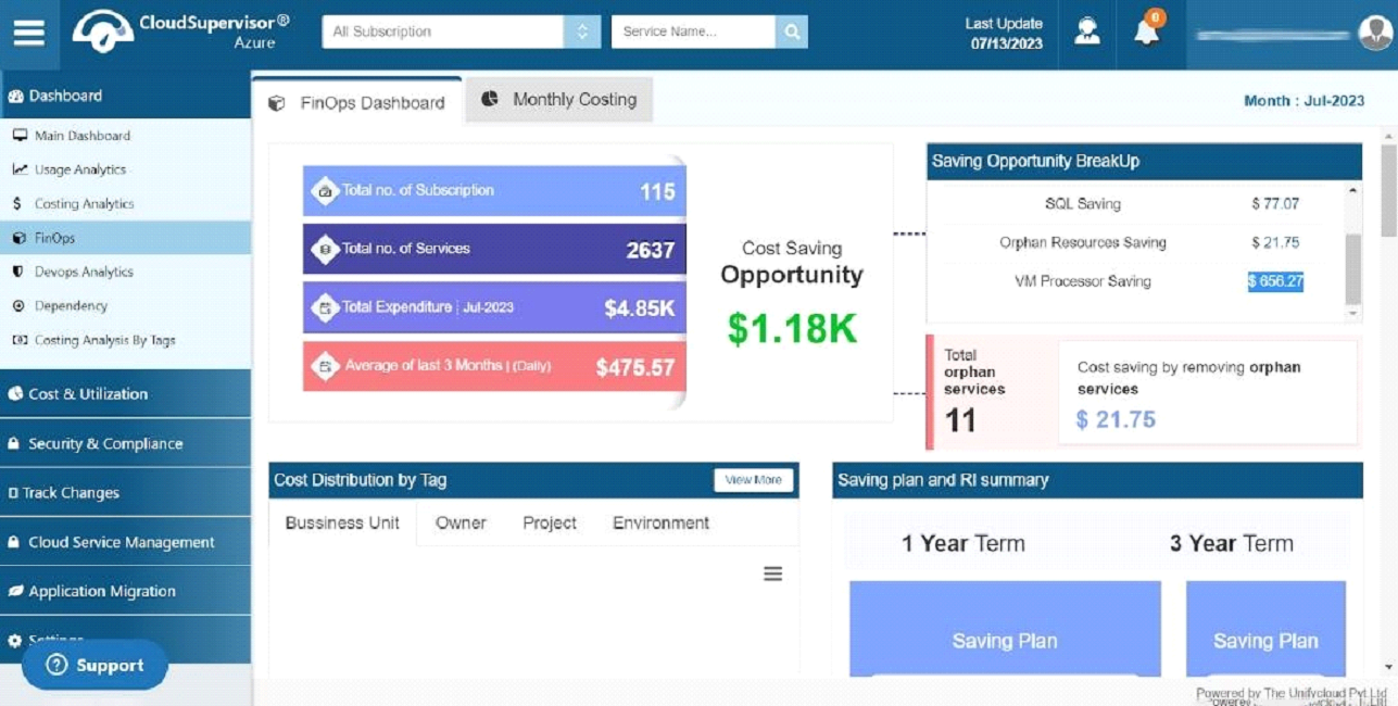
The dashboard allows you to view the entire cost summary at a glance. The information provided includes the total number of subscriptions and services and the total expenditure for a specific month. The average expenditure for the past three months and daily expenditures are also available.
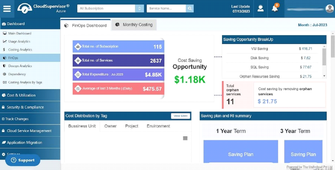
In addition to providing your cost-saving opportunity, this dashboard provides you with the grid for saving opportunity breakup, which includes VM Savings, Disk Savings, SQL Savings, Orphan Resources Savings, and VM Processor Savings.
Furthermore, we provide an overview of the number of orphan resources and the cost savings from removing orphan services.
Clicking on the VM Savings breakup link ($416.71) will direct you to the VM Utilization summary dashboard, where you can evaluate your entire VM savings.
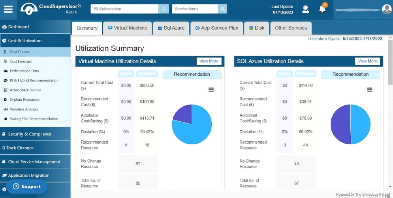
The dashboard shows the details of Virtual Machine Utilization Details, SQL Azure Utilization Details, Disk Utilization Details, APP Service Plan Utilization Details, and Other Service Utilization Details.
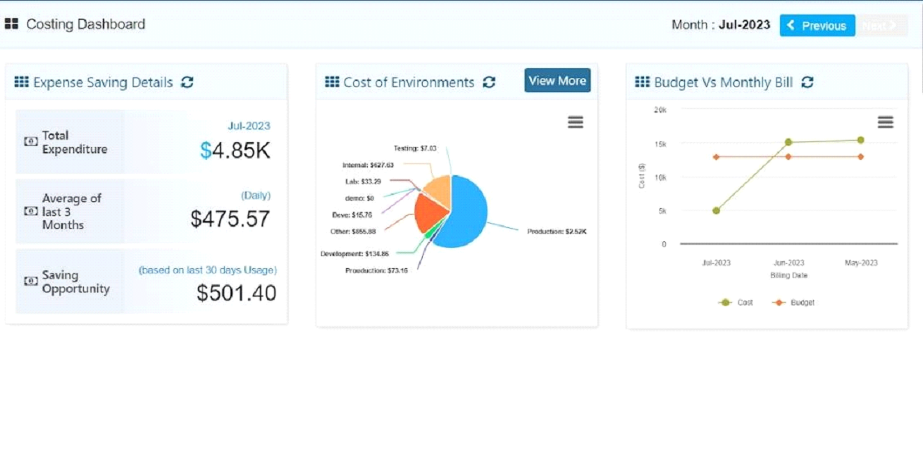
Clicking on the Disk Savings breakup link ($7.62) will take you to the Costing Dashboard.

Costing Dashboard provides information regarding Expense savings, including total expenditure, average cost for the last three months, and cost savings opportunities. This dashboard displays both the environmental costs and the comparison between the budget and monthly bills.
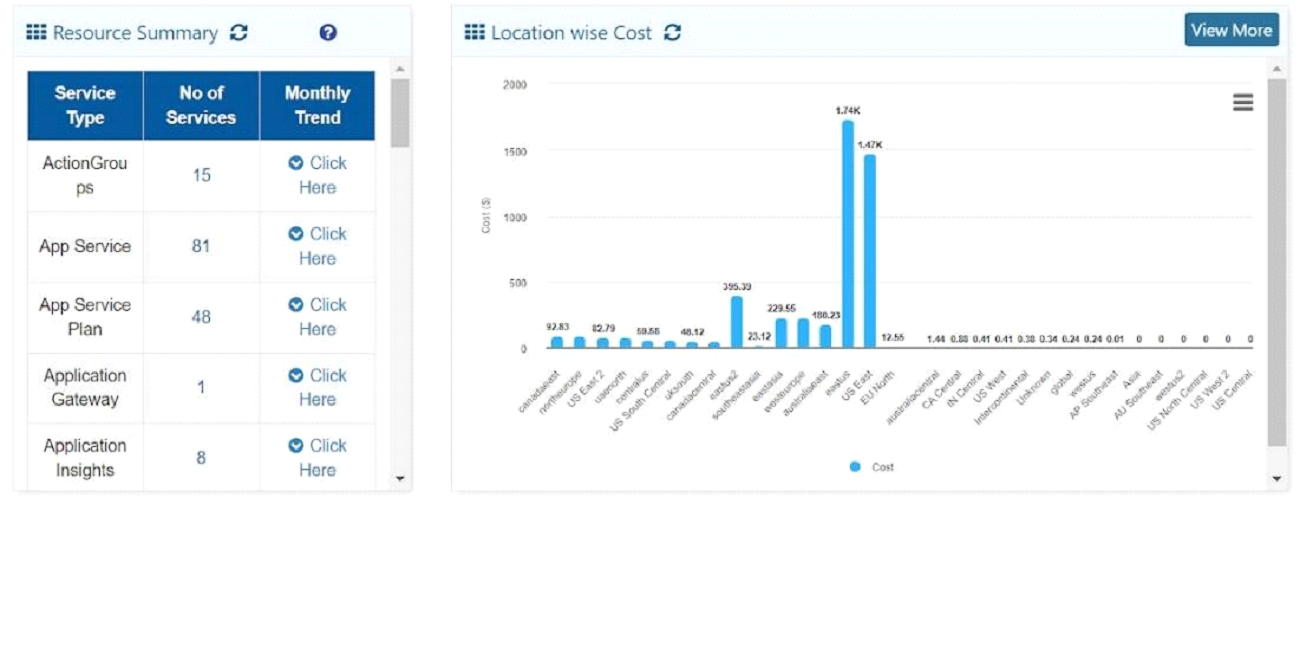
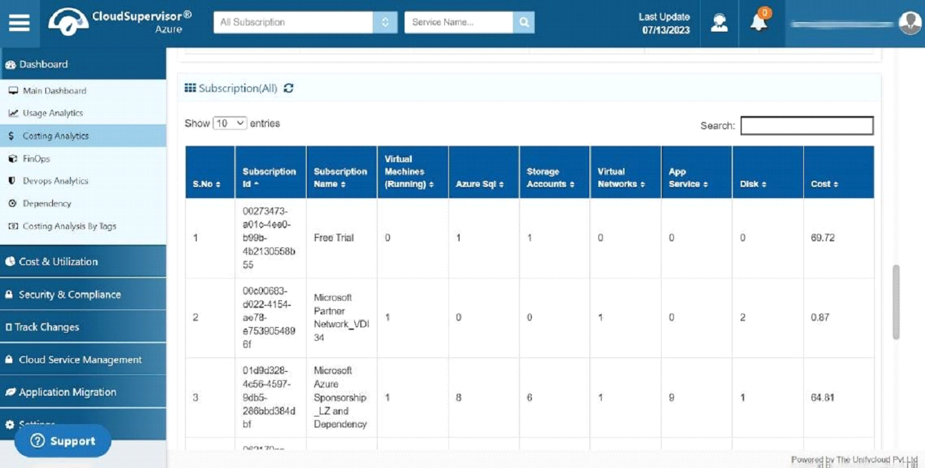
The dashboard provides information regarding resource summary and cost breakdown by location.
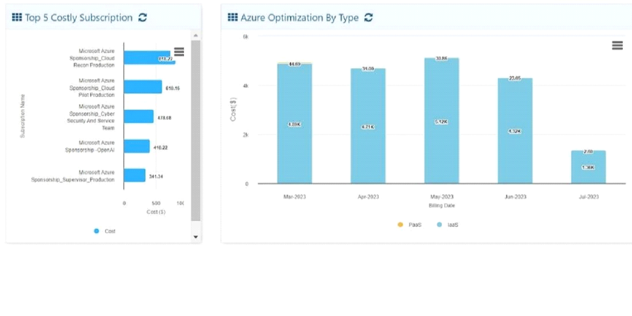
The bar diagram presents information about Azure Optimisation by type and the top five subscriptions.
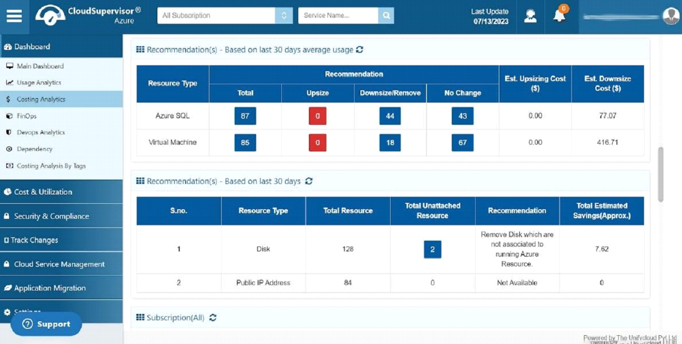
Based on the last 30 days of average usage, we also offer recommendations for upsizing/downsizing Virtual Machines.
Clicking on the SQL savings opportunity link ($77.0) in the Savings Opportunity Breakup will direct you to the SQL Utilization Summary dashboard.
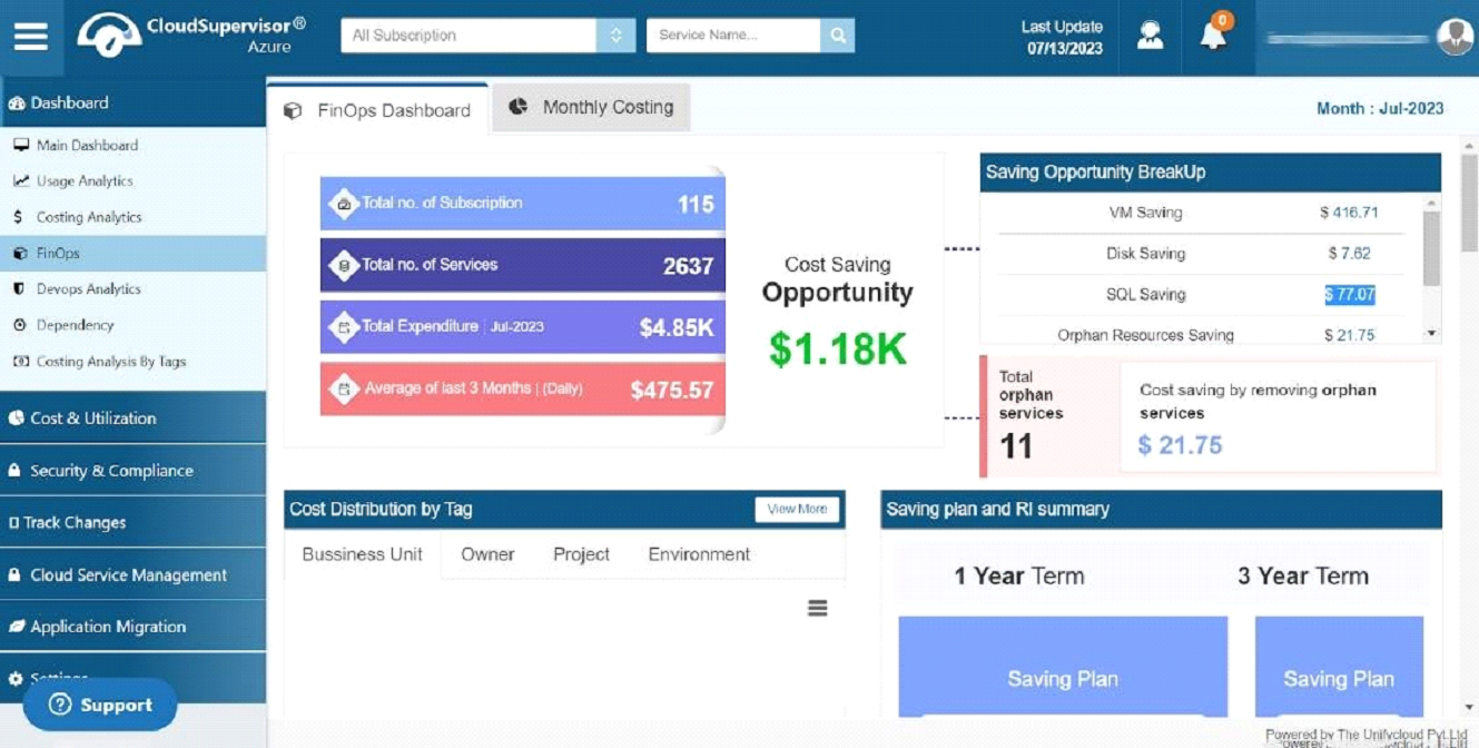
You will be directed to the Orphan Resource Savings dashboard when you click the Orphan Resources Savings link ($21.75) in the Savings Opportunity Breakup.

When you click on the VM Processor Savings link ($656.27) in the Savings Opportunity Breakup, it will direct you to the VM Utilization Dashboard.
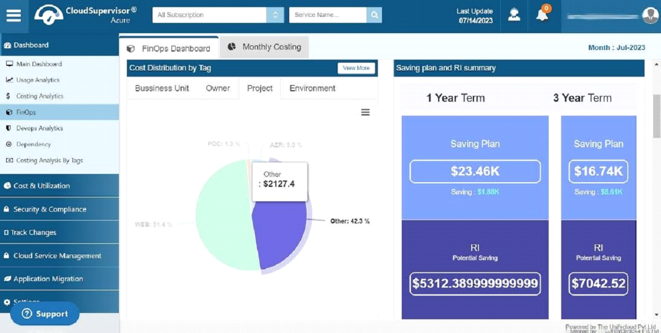
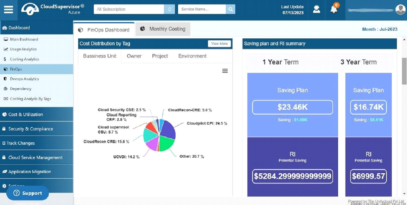
- 1.1.1 Cost Distribution by Tag
-
1.1 FinOps Dashboard
-
1.1.1.1 Business Unit
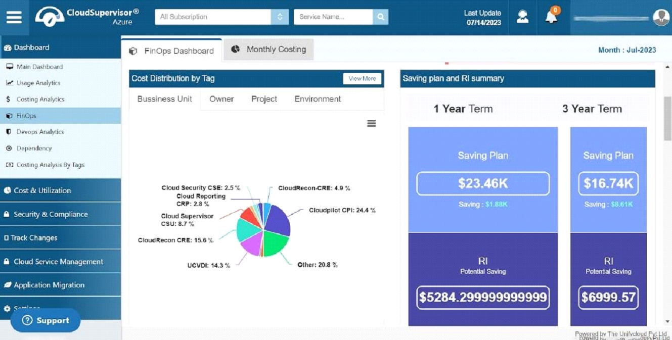
During the creation of a resource, the cost is distributed among various tags. According to the user's business needs, the different services are mapped.
The pie chart visually represents services such as Cloud Security, Cloud Reporting, Cloud Supervisor, CloudRecon, and others, as well as the cost distribution between these business units and the percentage contribution made by each.
-
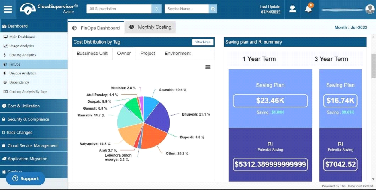
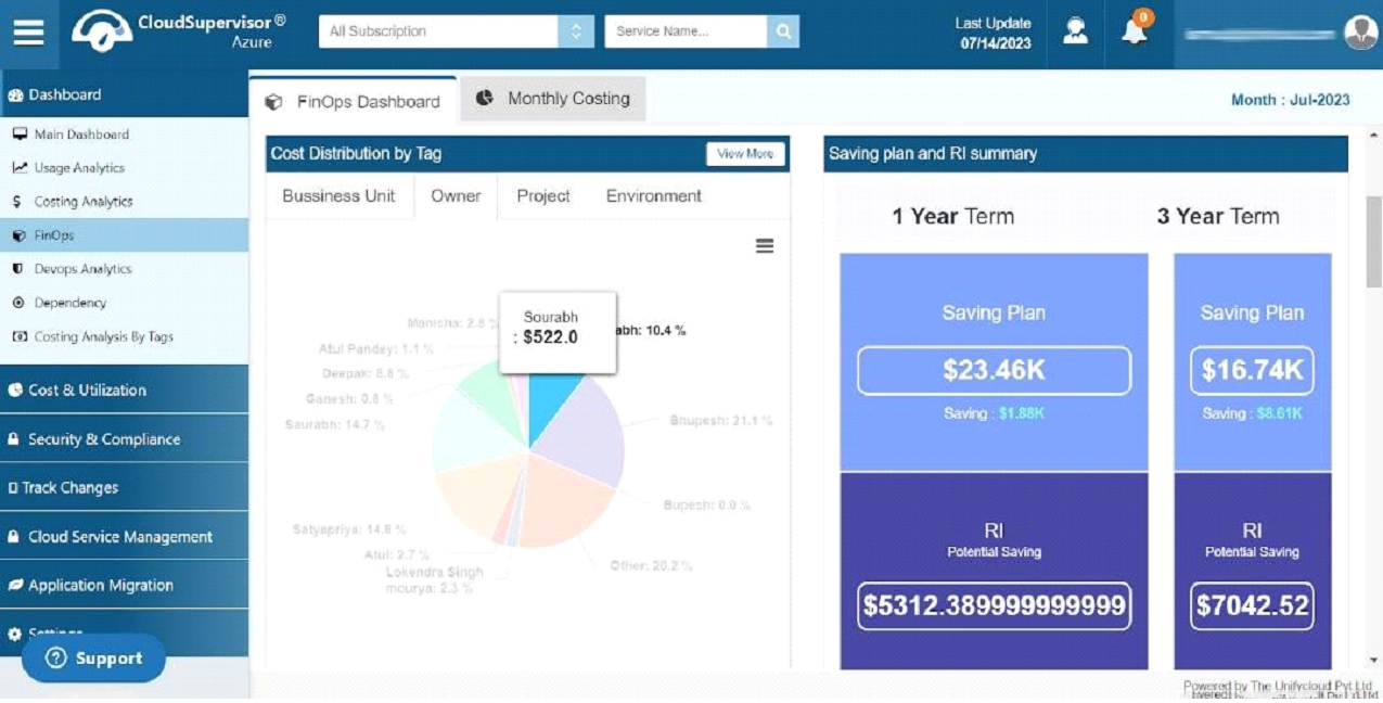
1.1.1.2 Owner
This pie chart illustrates the resources allocated to the particular Owners and their percentage allocations. A cost estimate accompanies each resource.
-
1.1.1.3 Project
Using this dashboard, you can view an overview of the entire project portfolio and its exact distribution percentage. It is also possible to view the costs associated with each project.
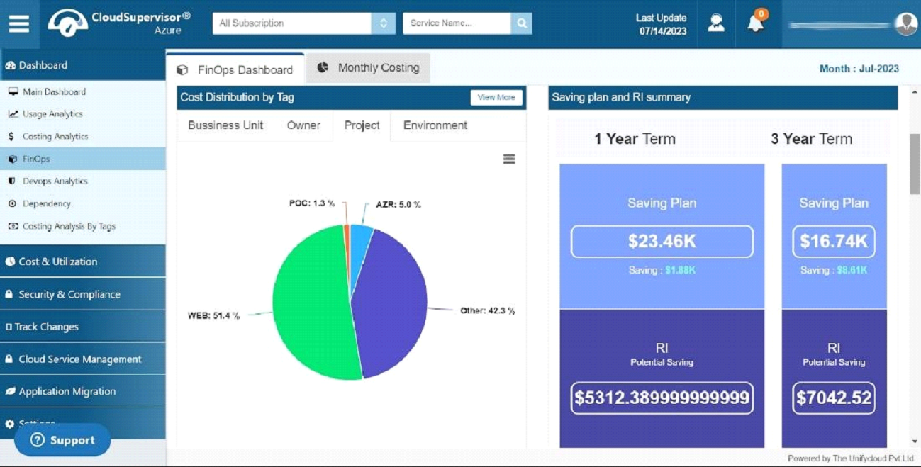
In this dashboard, you will find details regarding projects such as POC, AZR, WEB, and others
-
1.1.1.4 Environment
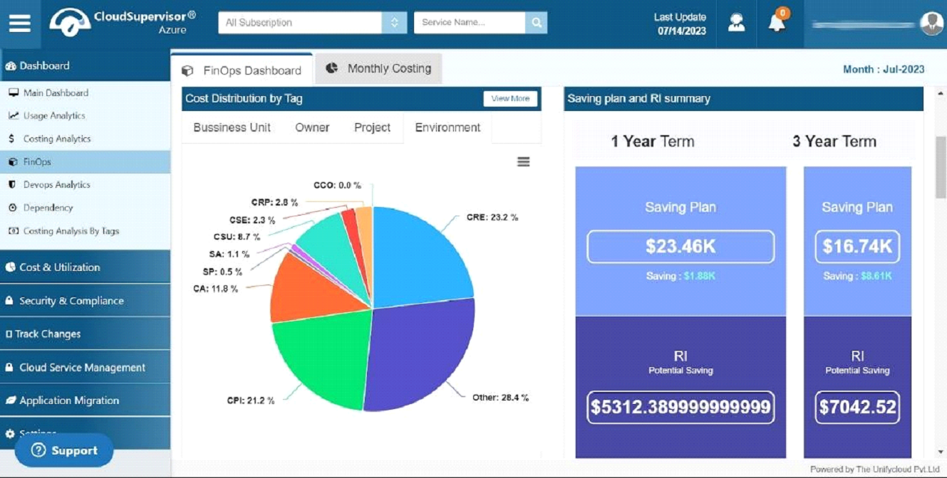
This dashboard provides a better understanding of the entire environment and its associated cost percentage. Additionally, it gives a breakdown of the costs associated with each environment.
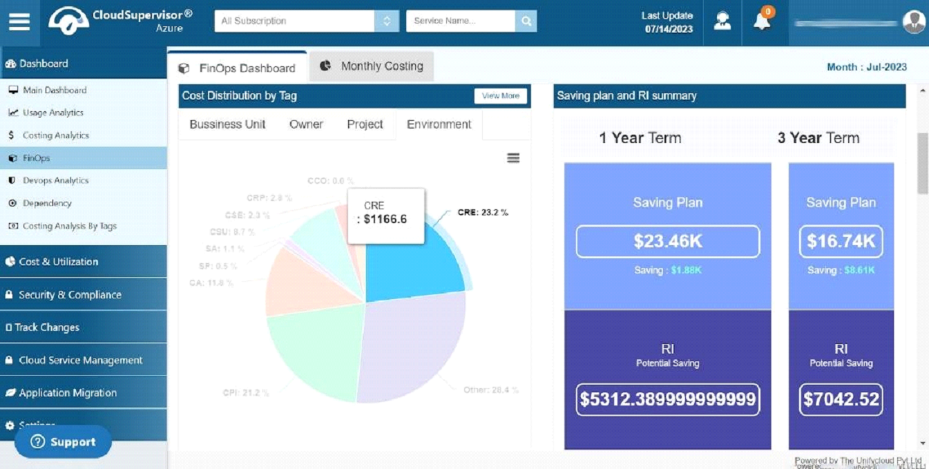
Distributing this information within your teams would assist in optimizing the cost
-
- 1.1.2 Saving Plan and RI Summary
- The information provided in the dashboard will give you a better understanding of our savings plan. We offer one-year and three-year plans. In contrast to the "Pay As You Go" plan, you can select the savings plan based on the Virtual Machine, Memory and CPU utilization and take advantage of more significant savings.
- RI Potential savings plan is available for one year and three years.
-
The three-year plan offers more significant cost optimization than the one-year plan.
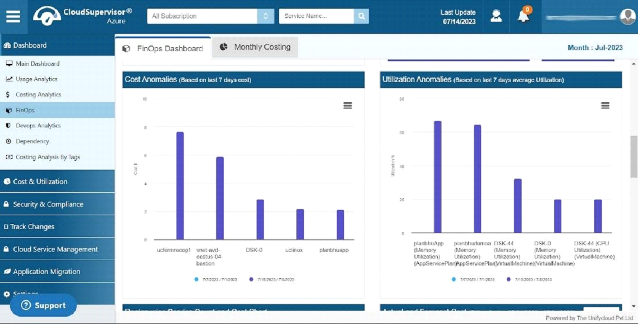
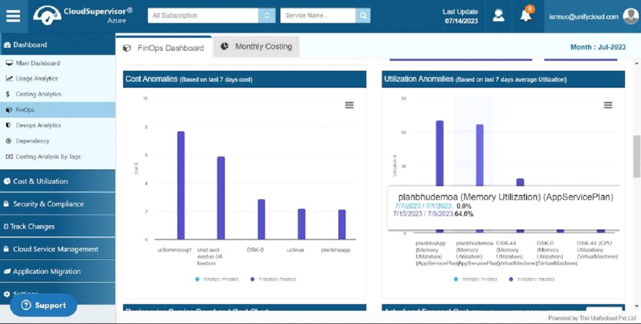
- 1.1.3 Cost Anomalies
-

It provides a comprehensive overview of the cost of the resources utilized during the last seven days. It offers the exact cost variation during a particular time frame and allows you to determine which resource has a higher cost.
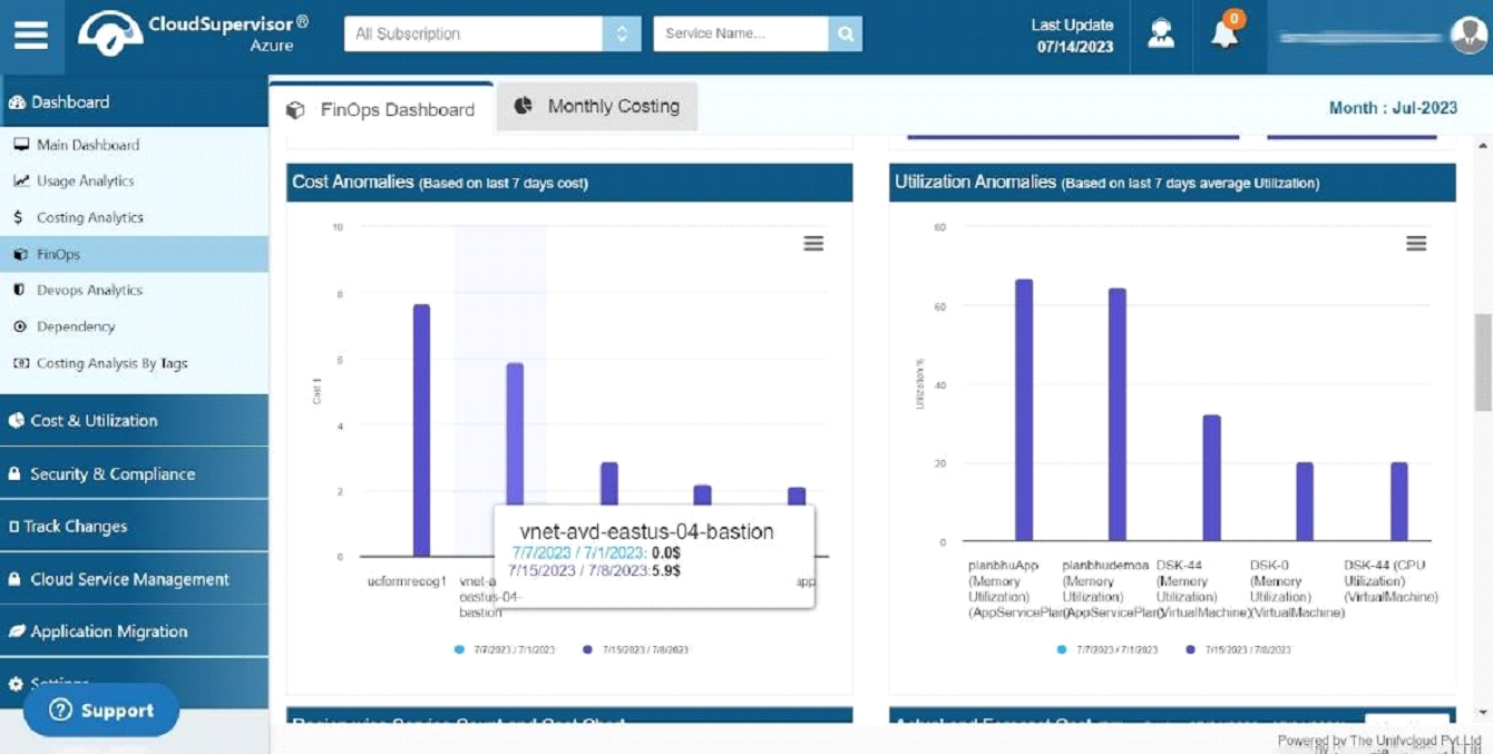
- 1.1.4 Utilization Anomalies
-
It provides a comprehensive overview of the CPU and Memory Utilization of the resources during the last seven days. The report details CPU and memory utilization per Resource over a specified period and allows you to identify which resources contribute to a cost increase.
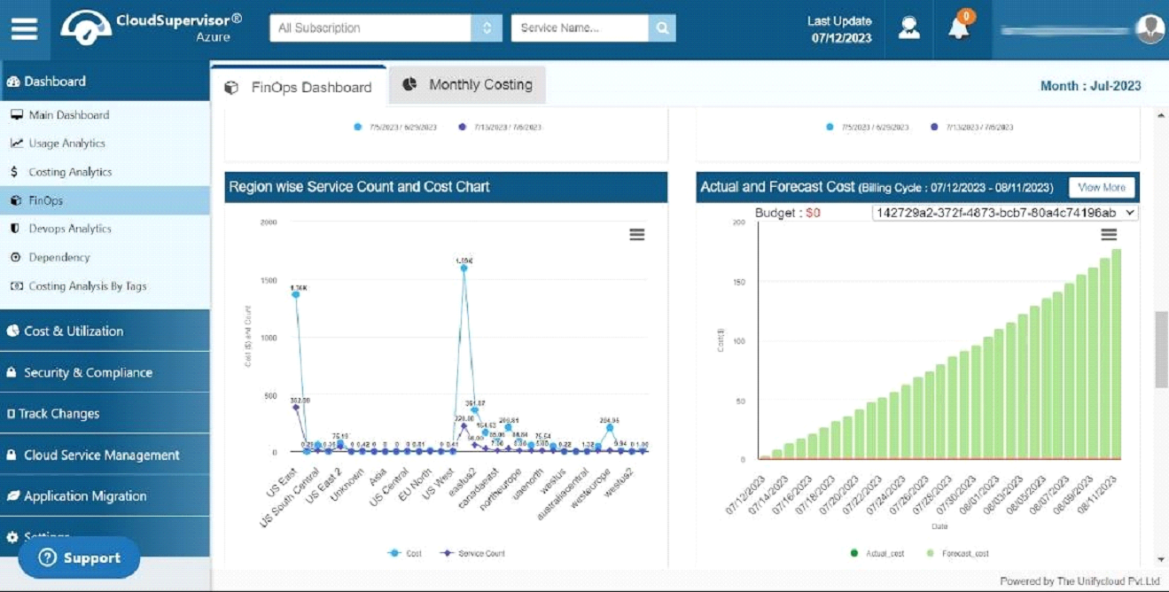
- 1.1.5 Region wise service count and cost chart
-
Here we provide the region-specific service count and the overall cost for that service within that region.
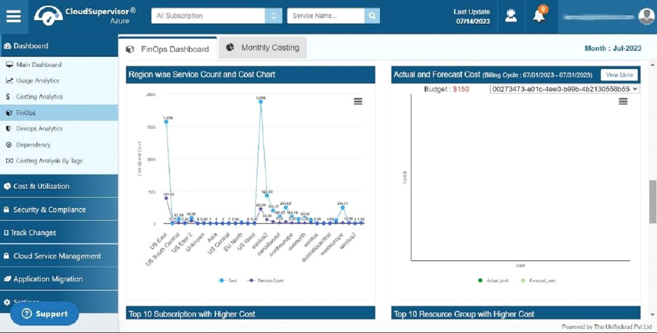
- 1.1.6 Actual and Forecast Cost
-
The dashboard displays your subscription's actual cost and forecast cost in a particular billing cycle and varies from subscription to subscription. Dark green indicates the actual cost, while light green indicates the forecast cost. Based on these outputs, you can quickly analyze your cost variations and optimize your budget.
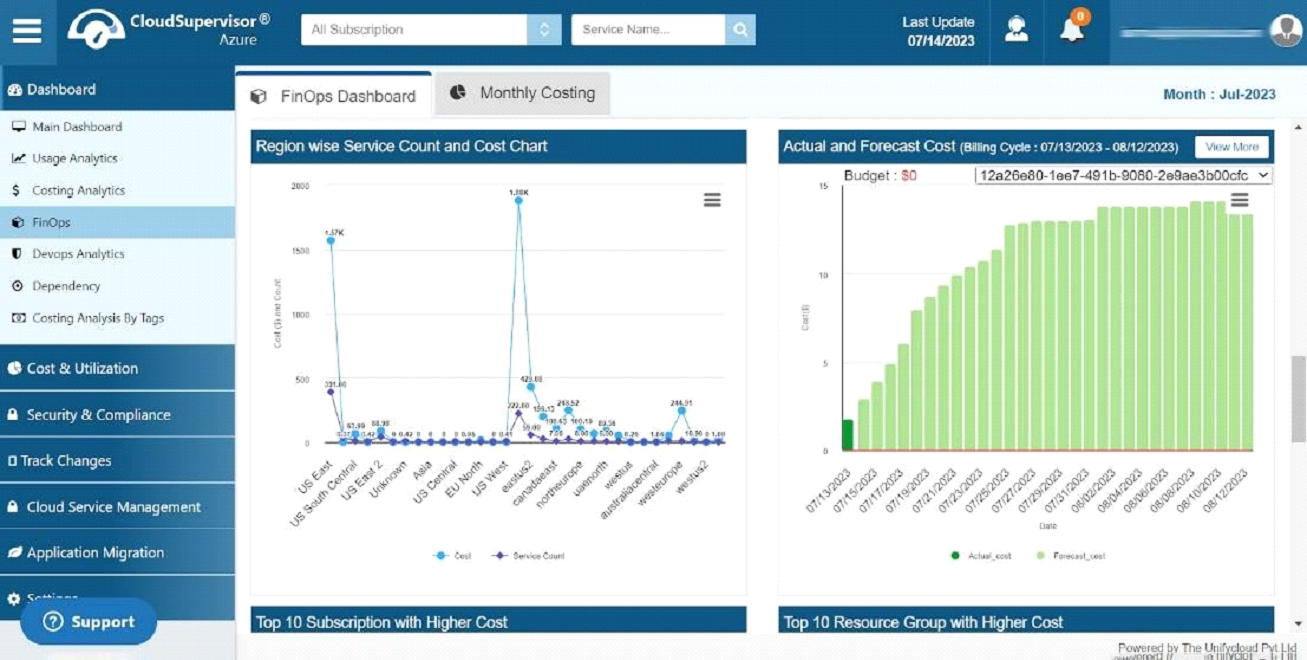
- 1.1.7 Top 10 Subscription with Higher Cost
-
In this dashboard, you will find information about the top 10 subscriptions with the highest costs.
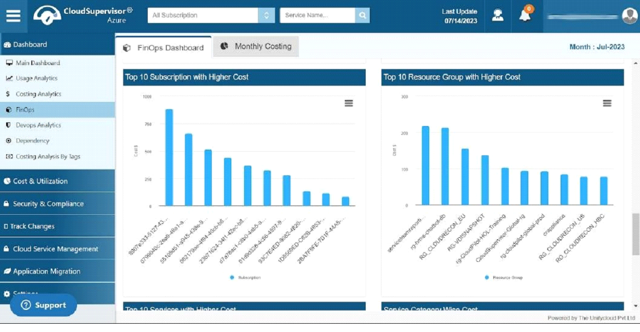
- 1.1.8 Top 10 Resource group with Higher Cost
-
The dashboard provides information regarding the top 10 Resource Groups with the highest costs.
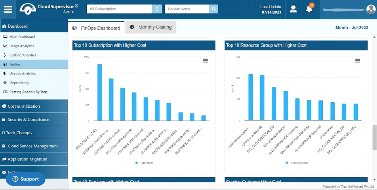
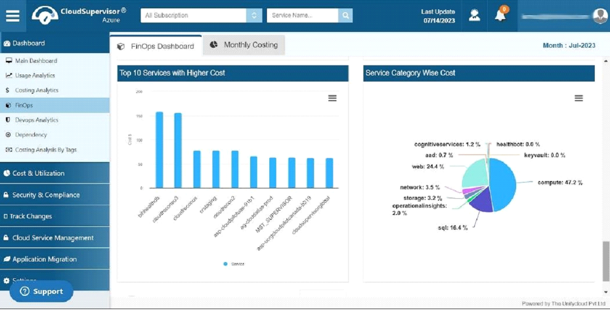
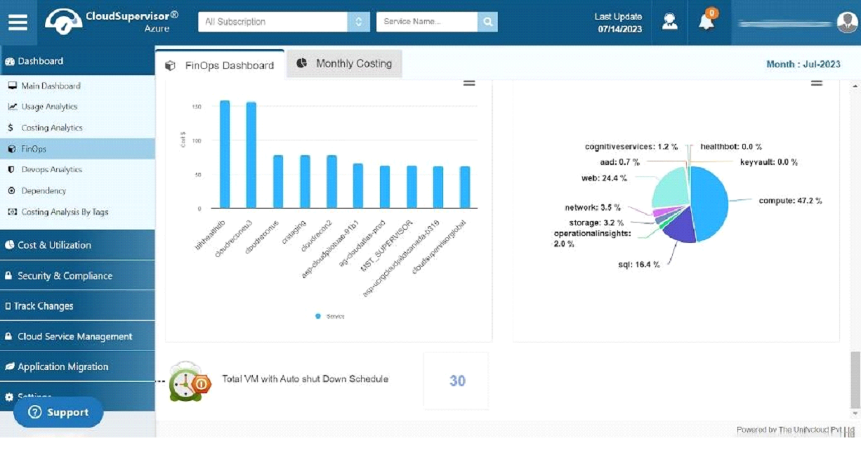
- 1.1.9 Top 10 Services with Higher Cost
-
In this dashboard, you will find information regarding the top 10 most expensive services
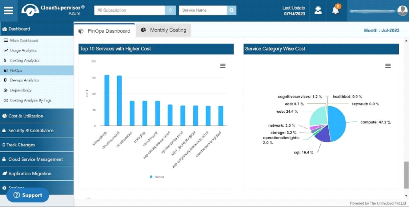
- 1.1.10 Service Category Wise Cost
-
This pie chart shows the different services and their corresponding percentages. It also provides an overview of the individual costs associated with these services. Analyzing category-wise service costs will allow you to take measures to control them.
- 1.1.11 Total VM with Auto Shut Down Schedule
-
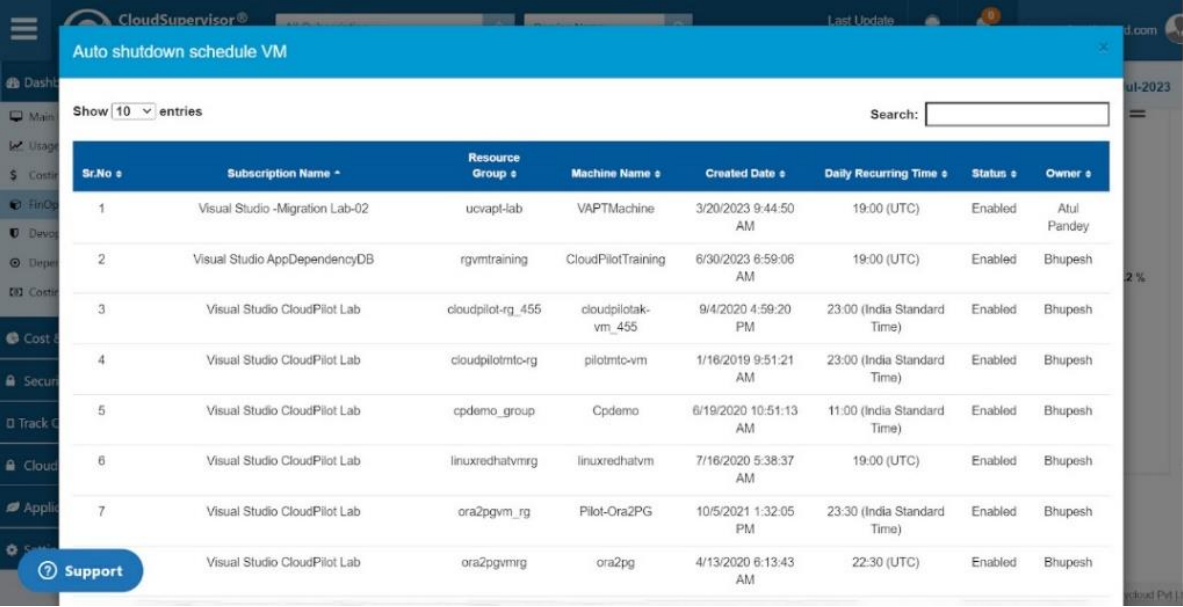
The dashboard displays a count of auto-scheduled virtual machines that remain inactive or shut down for a particular time. By clicking on the count (30), you will be directed to the grid containing the details of the Auto Schedule VM along with the subscription name, Resource group, machine name, created date, daily running time, status, and owner information.
-
-
1.1 FinOps Dashboard
-
2. Finops Dashboard - Monthly Costing
-
This Dashboard provides the costing details as per your subscription for a single month. It also summarises the information about the Owners, the total and the Average cost.
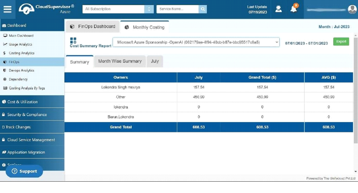
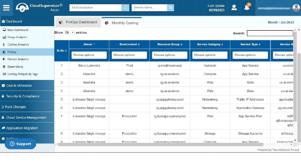
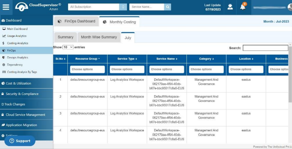
You can get the month-wise costing summary and the details of Environment, Resource group, Service Category, Service Type and Service Name.
-
- Cost & Utilization
-
3. Cost Control
-
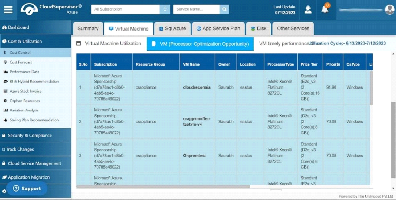
3.1 Virtual Machine
-
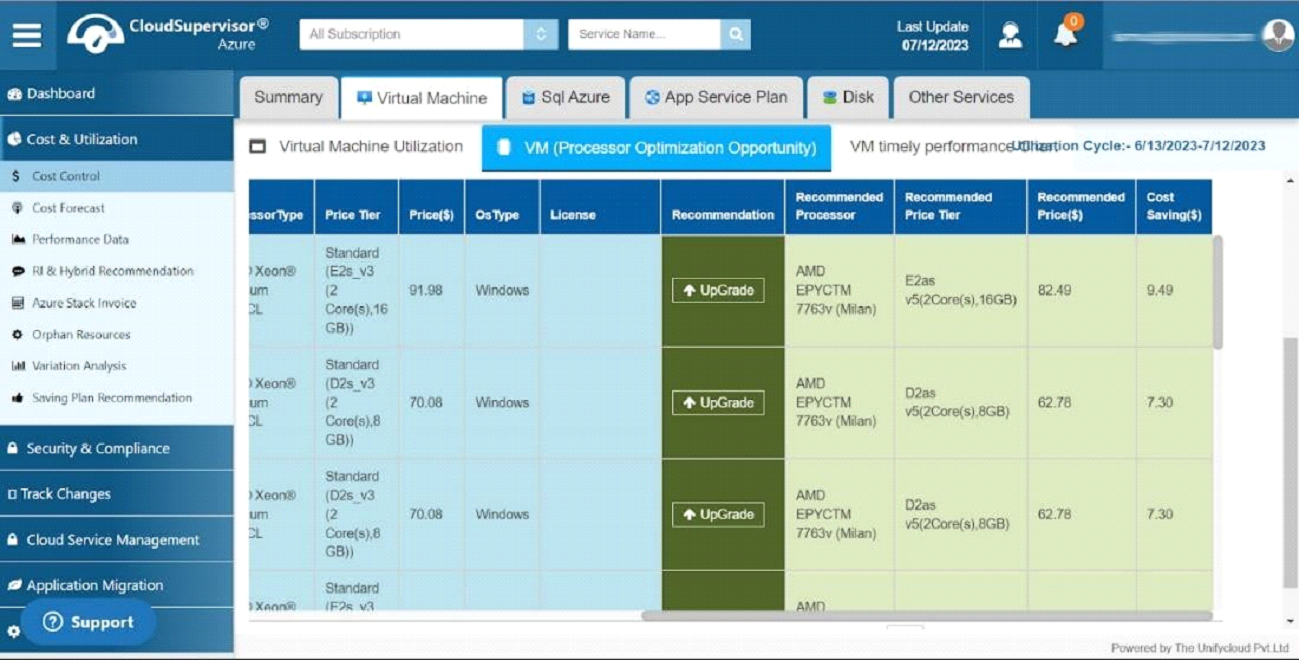
3.1.1 VM (Processor Optimization Opportunity
The VM (Processor Optimization Opportunity dashboard) provides an overview of current costs, recommended costs, and details regarding cost optimization. Additionally, this dashboard displays the recommended resources, the details of the resources that do not require modification, and the total number of resources.
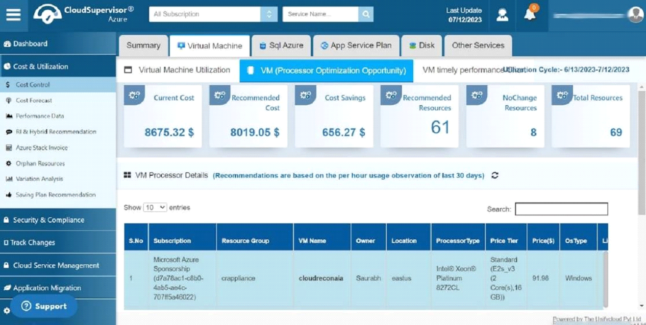
This dashboard displays the subscription details of clients. Here you will find details concerning various virtual machines on different tiers and information regarding the owner, location, processor type, pricing, and operation system
The price Tier and processor type grid provide information regarding the processor type (Intel) and the memory capacity. Considering per hour usage observation of the last 30 days, we recommend upgrading your processor from Intel to AMD with the same memory capacity at a lower cost. You can Upgrade the processor to benefit from additional cost savings.
-
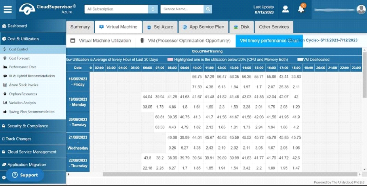
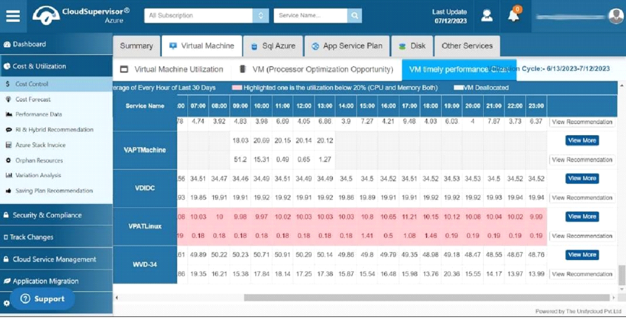
3.1.2 VM Timely Performance Chart
This provides a timechart based on the per hour utilization of Virtual Machines. This chart holds the information of the different services , the cpu and memory utilization percentage and the time span of operation of virtual machines.
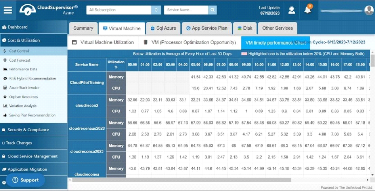
This dashboard displays a blank grey area associated with the Cloud Pilot training between 00.00 and 04.00. In this instance, the virtual machine is deallocated or not used during this time. It is possible to analyze the performance of virtual machines along with the deallocation interval for the last 30 days
Click the "view more" button to view the total and average utilization of every hour during the past 30 days. In the event that your virtual machine utilization is limited, you may downsize the virtual machines and enhance the cost-optimization process.
The grid highlighted in pale red indicates where the CPU or memory utilization on your virtual machines is less than 20% over a given period based on an average of 30 days. You can downsize or deactivate the Virtual Machines during that period to optimize the cost.
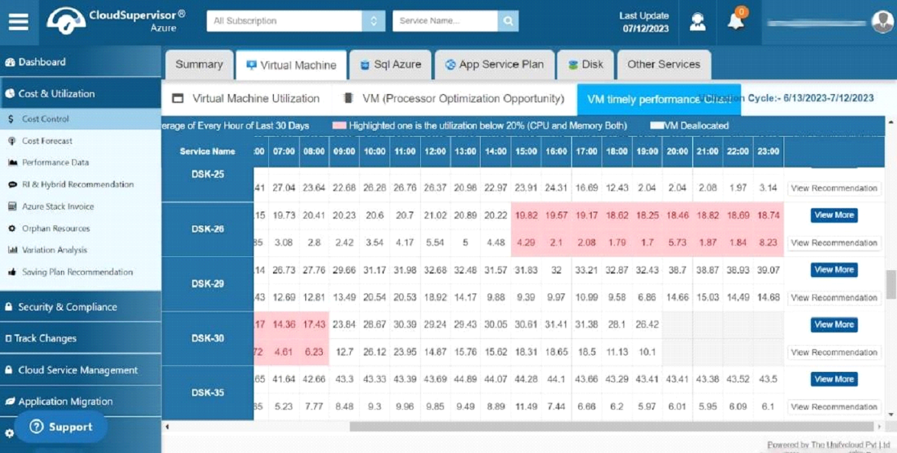
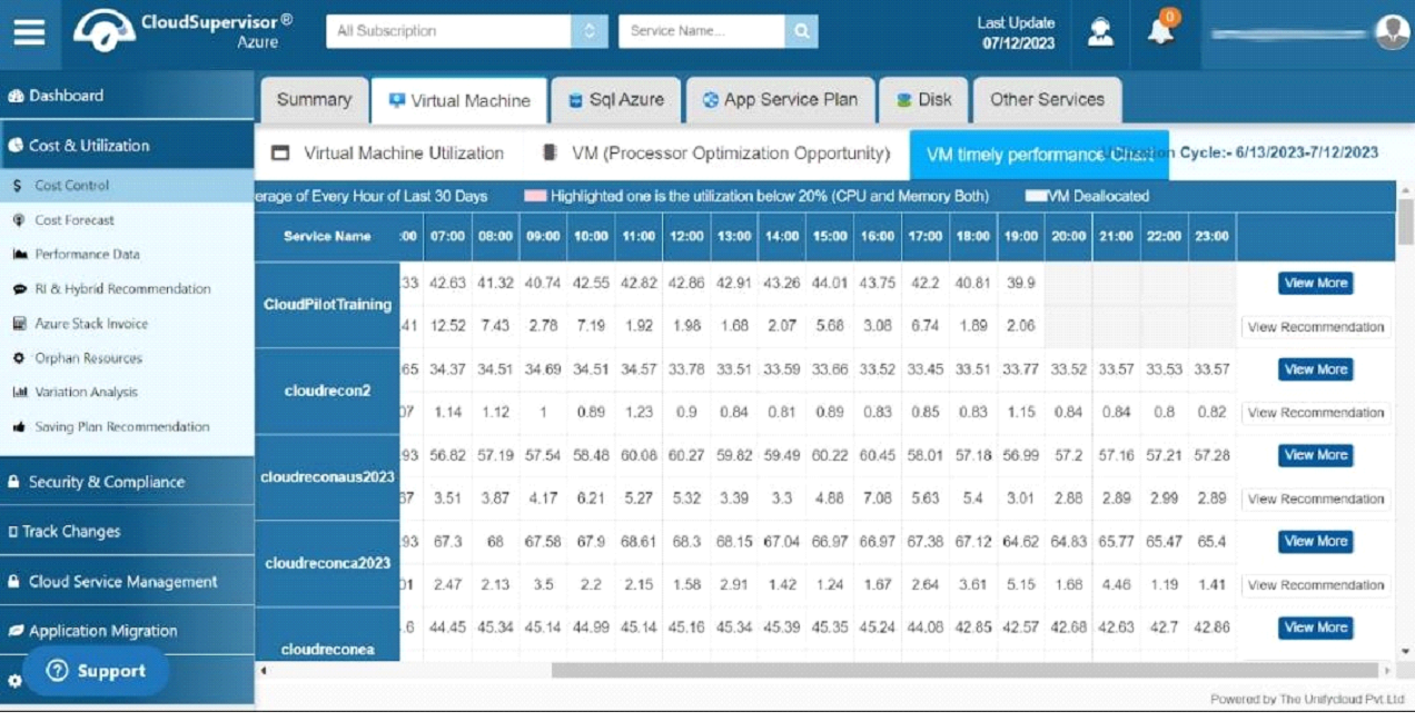
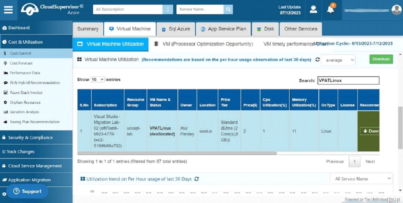
By clicking on the view more button, you will be able to view the virtual machine utilization grid on an hourly basis for the entire day. You can obtain information based on the last 30 days
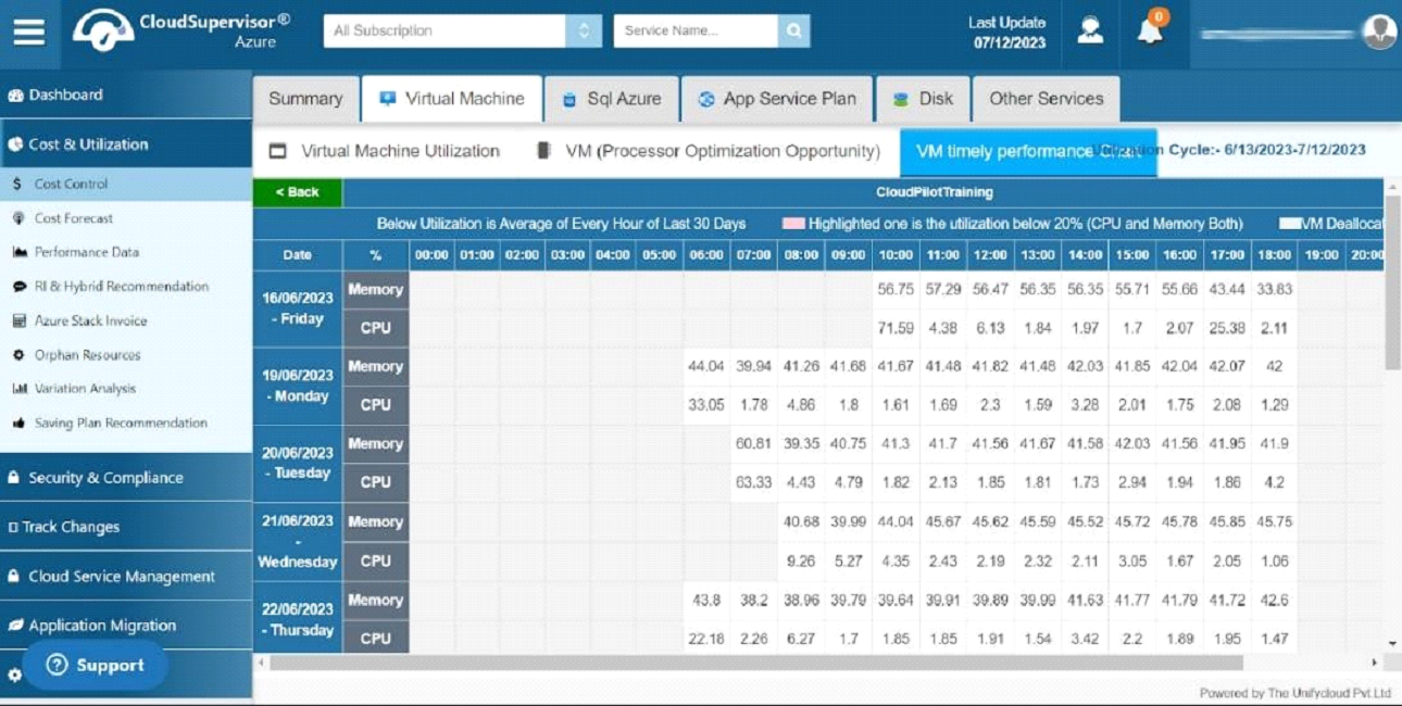
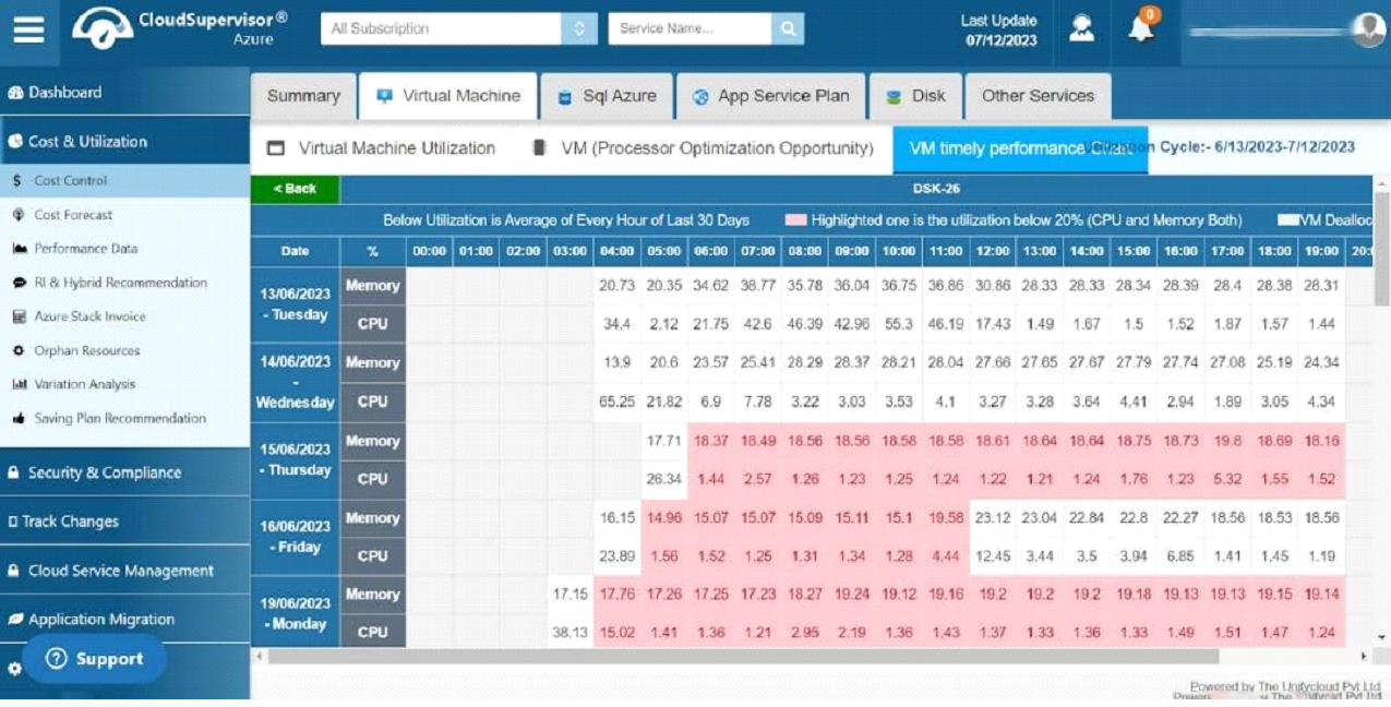
The dashboard provides information concerning virtual machines whose CPU and memory utilization is less than 20%.
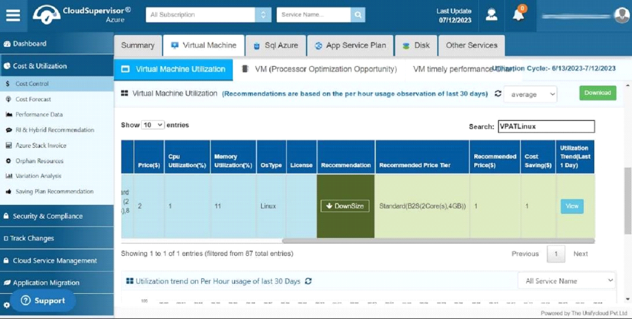
Click on view more button you will be directed to the dashboard below. Based on your utilization grid, if your CPU/Memory utilization is less than 20% we offer recommendations to optimize the virtual machines in a better way.
For this virtual machine, "VPATLinux", the CPU/Memory utilization is less than 20%, so we recommend downsizing it to optimize its usage and cost-effectiveness.
-
3.1.1 VM (Processor Optimization Opportunity
-
3.2 Disk
-
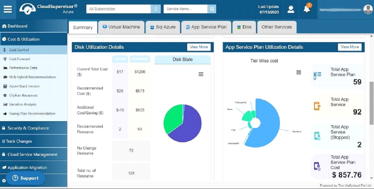
In this dashboard we provide various information about Disk types
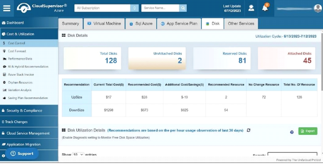
In this dashboard, you can view the total number of disks, the exact number of unattached disks, the reserved disk count, and the information about the attached disks.
You are charged for the unattached disks, even though you are not effectively utilizing them.
Furthermore, we provide a recommendation grid that can be utilized to analyze the upsize and downsize costs and initiate additional savings.
-
3.2.1 Disk Utilization Details
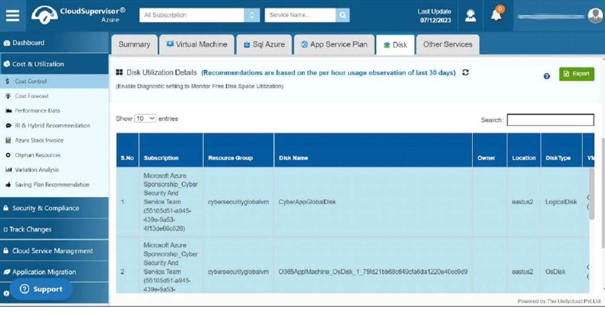
In this dashboard, you will find information about your subscription, resource group, disk name, location, disk type, disk state (attached, reserved) and price tier.
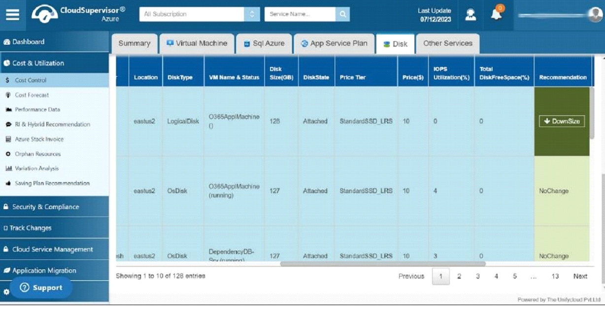
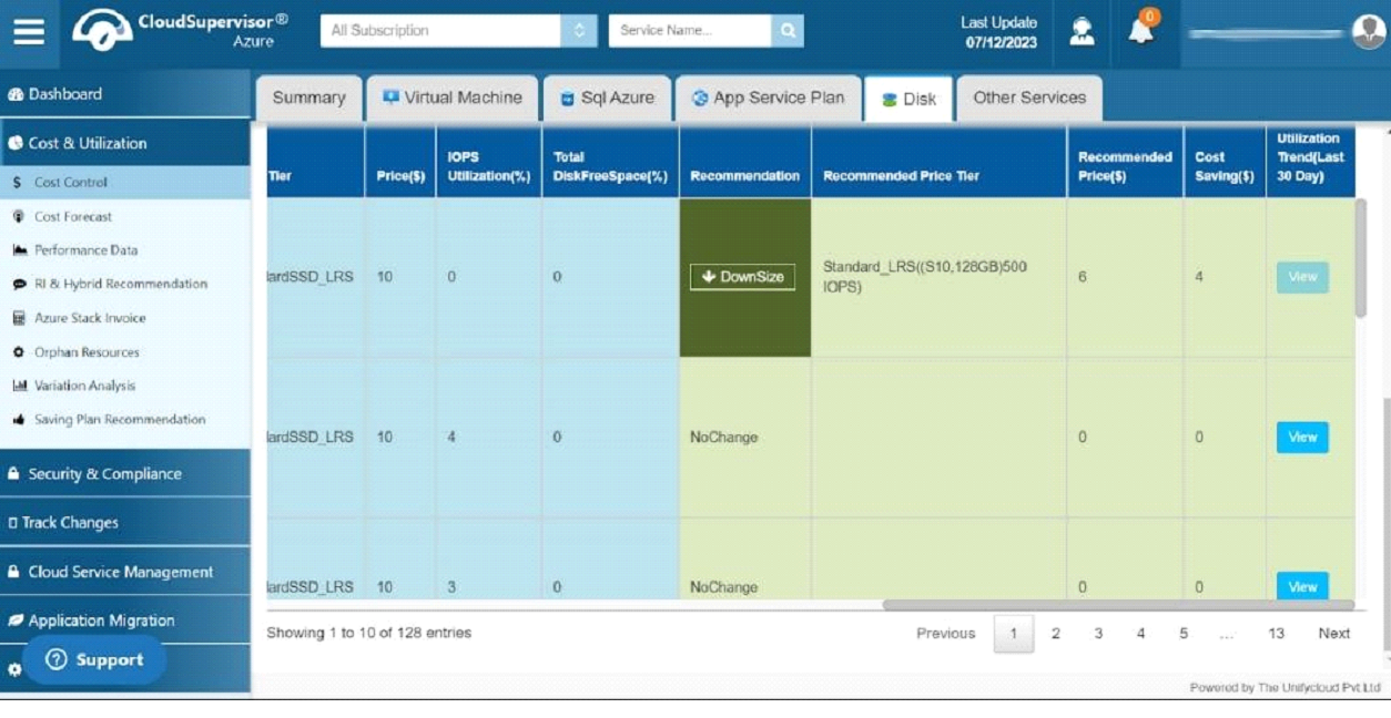
Depending on the IOPS utilization, we provides recommendations to (upsize, downsize,no change) optimize the status of virtual machines which in turn benefit from cost saving. You can also export this recommendation to the Excel sheet.
-
-
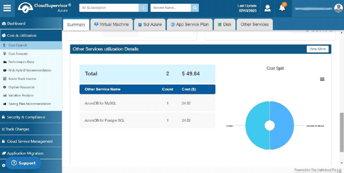
3.3 Other Services
-
This dashboard provides the details of AzureDB for MySQL and Azure DB for PostgreSQL.
-
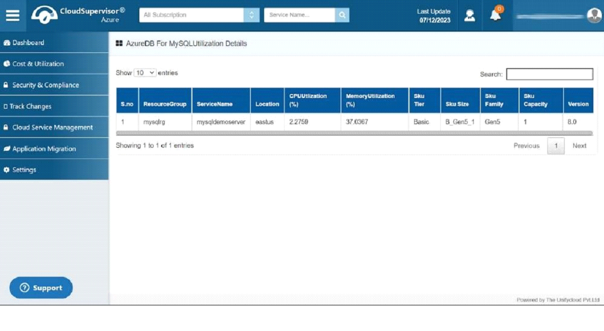
3.3.1 AzureDB for MySQL
The following is an overview of the total subscriptions, services, and cost standard
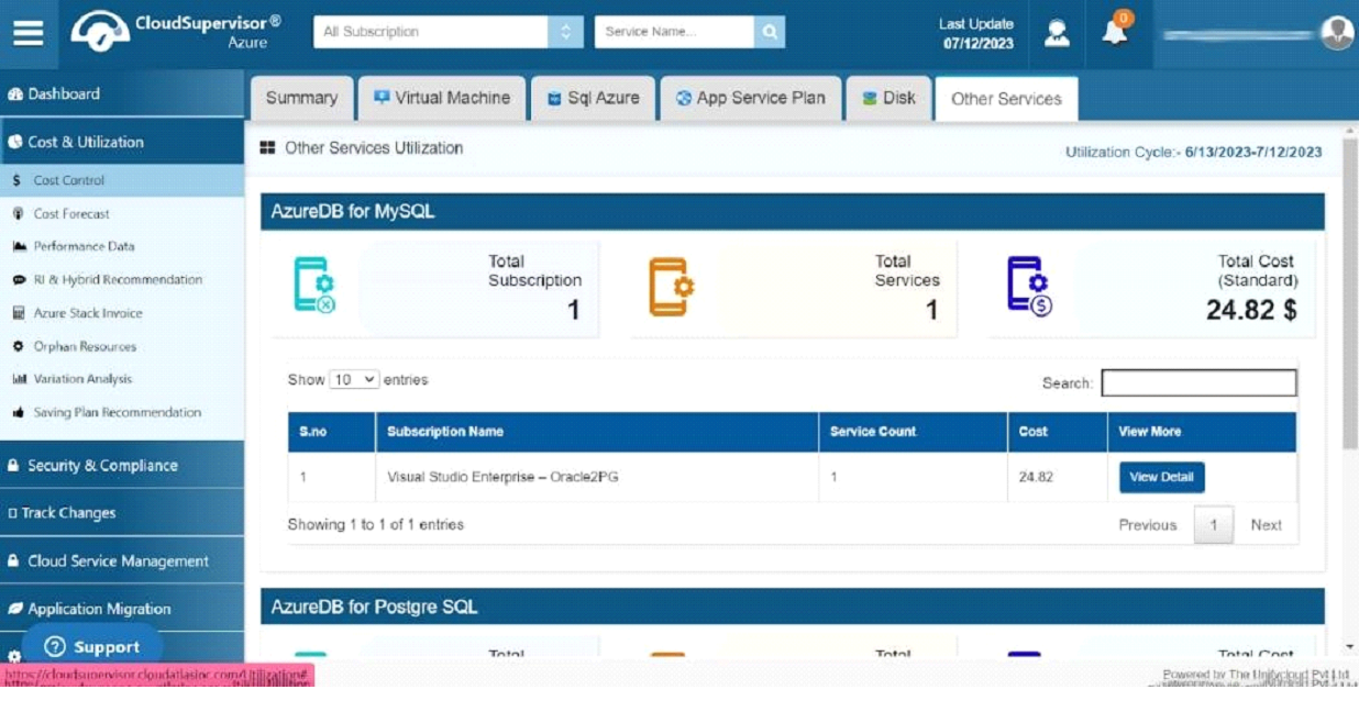
The dashboard provides a detailed overview of each subscription, including the name of the subscription, the number of services, and the cost for each subscription.
Click on the view icon to direct you to the AzureDB For MySQLUtilization dashboard, which gives the entire details of the particular service, CPU, Memory utilization percentage, and version history.
-
3.3.2 Azure DB for Postgre SQL
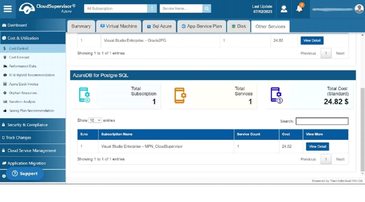
The dashboard provides information about the total number of subscriptions, the total number of services, and the total cost. In the grid, you can see the name of the subscription, the number of subscriptions and the cost per subscription.
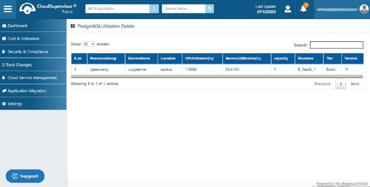
Click on the view icon to access Postgre Utilization Details. This dashboard comprehensively overviews service details, CPU and memory utilization percentages, and version history.
-
-
4. Orphaned Resources
-
This dashboard provides the details of total orphan services and the total cost
-
4.1 Orphaned Resources
Orphaned Resources are incurring additional costs despite being unused. You can keep track of the orphaned resources on the dashboard to save costs
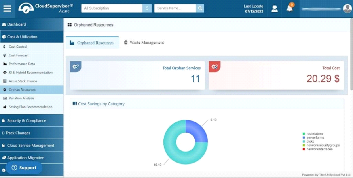
The cost savings by category pie chart provides the cost details based on the category, such as route tables, server farms, disks, network security groups and network interfaces.
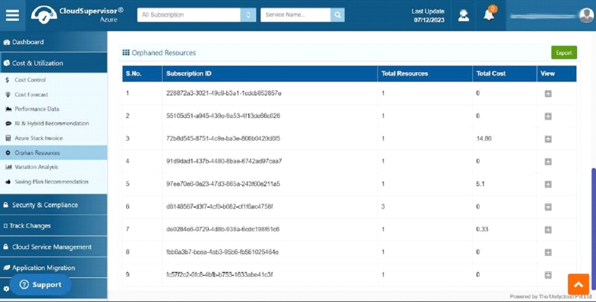
This dashboard lists orphaned resources and their details, including Subscription ID, total resources, and total cost. To view information about a specific subscription, click the plus icon.
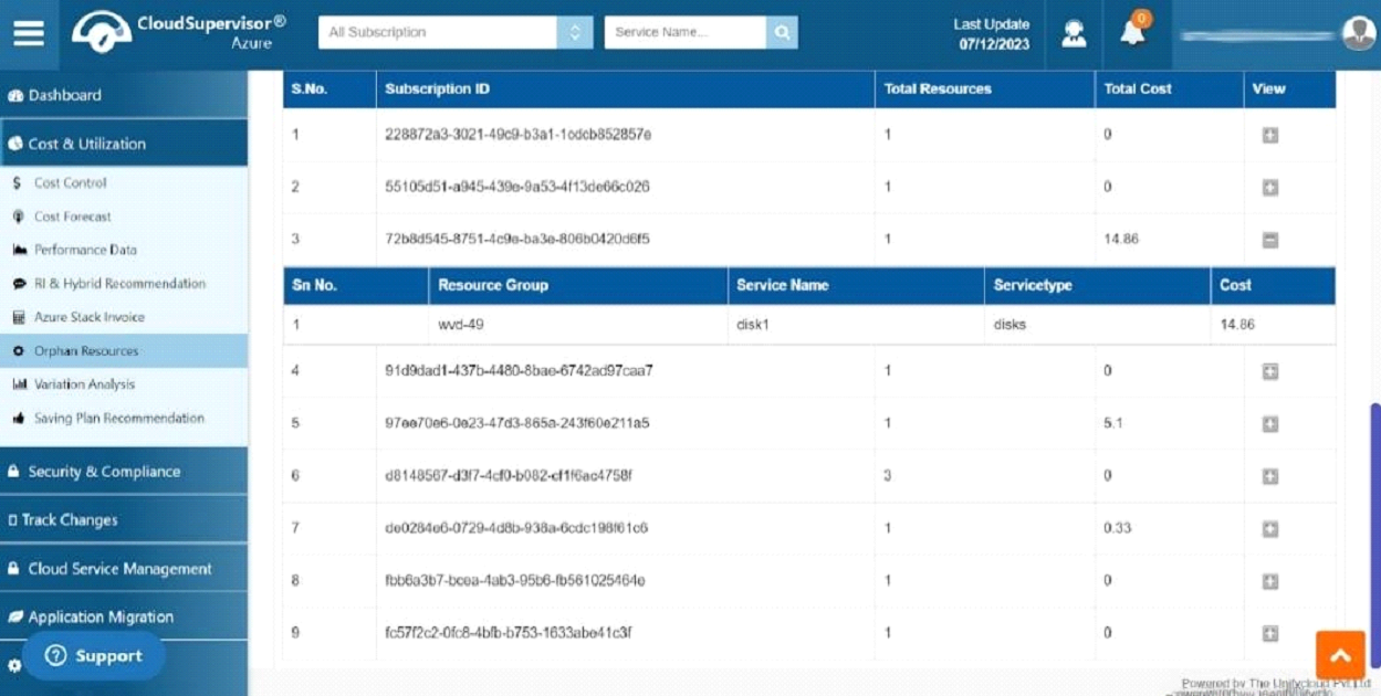
This will direct you to the grid with the details about the resource group that is responsible for the unwanted cost
-
4.2 Waste Management
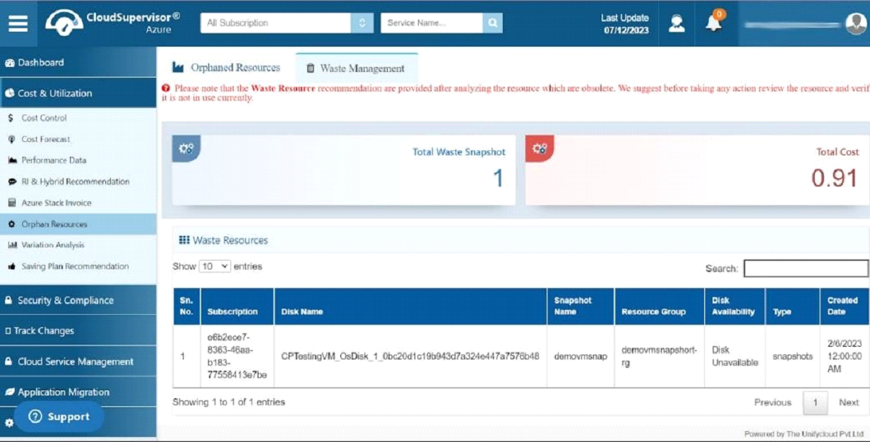
The waste management dashboard helps identify and manage unused resources, reducing costs. It also provides recommendations to manage them effectively
-
-
3.1 Virtual Machine